Tuesday 30 September 2014

Film Noir lighting


Film Noir's lighting emphasizes shadowing and harsh lighting in order to create a sense of volume and depth in films that embodies the film noir style.

It originated out of Europe after the Second World War and the 1940s and 50s saw the rise and huge success of the film noir genre on the silver screen. Today, the look is still popular in such films such as Black Swan and Drive and Sin City.

The film noir look is using low-key lighting as well as emphasizing shadows and harsh lighting which will capture the dark side of American life: urban crime, mobsters and thieves. To light a film noir style, there are three basic things to remember;
  • To get hard crisp shadows, use a small intense light 
  • Emphasize the difference between high and low-key lighting 
  • Use at least 500 watt lights to get solid crisp backs and stark whites


A fogy background can also have a great effect to a silhouetted figure, especially when lit from the back. Shadowy figures are a big part of the film noir look and a well used technique even in modern days. Again, using intense lighting, set up a series of lights that will be out of frame and slightly behind the actor so that the shadow is projected on the wall behind.


RESEARCH VIDEO -->


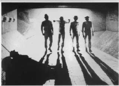
The image shown here is a good representative of what film noir is all about. Low-key lighting has been used to creates a mysterious setting as you only identify the two characters as female and male. Back lighting is also used in the image because a silhouette is created. You can also notice the contrast between the female's shadow being darker than the male's shadow. This indicates that the female shadow has a deeper besides meaningful character to the male as she made to be noticed more. Also the foggy background aids in enhancing the silhouette figures. It makes the shadows stand out and look more rounded so you can therefore identify a few details about what the shadow is or what props they may poses.


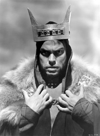
This example of an film noir extract has many different lighting techniques to fit the theme of film noir. At first, the scene seemed to be low-key lighting as you could only see shadows and dark lighting. However as the scene goes on, it moves on to high-key lighting, as more filler lights were used. The effects clearly portrayed a poorly lit scene and the contrast between light and dark is much less pronounced. However, lighting was used on the characters faces for effect for example the main character had top lighting glistening on his face making him recognisable. On the other hand, the character he was talking to had no lighting on his face which created a dark and mysterious feel to the extract. This can convey that character to being a antagonist to the extract as the iconography of that effect is usually associated with the villain.


analysing lighting images

Lighting

In this Image shown, there is a great use of chiaroscuro or low key lighting. There is a clear indication of contrast in this image as the image goes from dark to light. The back lighting is used in this image so as to accentuate the features of a character so as to make her look alluring. This gives the effect of a glamour image as the light is mostly concentrated on her face which portrays a protagonist image.


In this second image, the light and dark is much less pronounced therefore making it a high-key lighting being used. Due to the lighting effect, it causes the image to seem as if it is a cloudy day.


This image is a low-key lighting image to exaggerate the weather in the background which is been set out as a rainy day. Also the contrast has been set here so that only his face can be seen clearly. Under lighting is used to give the character a intensifying look which overall gives the image a horror action genre due to the lighting effects. The effects gives the character a antagonist feel. 


In this image, it is clearly shown that high-key lighting is being used as this frame appears to be from a dimly lit scene. However the lighting used gives the character a shadow which portrays the theme of thriller as it gives a mysterious atmosphere. 


Once again, high-key lighting is being used as there are more filler lights. The lights are coming from the window which, due to the blinds, cause a flickering effect. This helps give the overall romance effect especially since this effect is only being shown on the two characters. 


This clearly represents low-key lighting as the effect of chiaroscuro produced here dramatic shadows. The shadows are also from the back lighting they are used to create a silhouette. This effect of lighting gives a quite a mysterious yet frighting look to the image conveying the genre of thriller.


The next image low-key lighting has been used to emphasize the characters scared face, The back light displays her shadow creating a anxious spine tingling feeling in the atmosphere clearly linking to the genre of horror


This image has been given a high-key lighting effect as the image looks more realistic compared to other images. It seems to be a very lit up room as the contrast is very little. The top lighting effect being used gives the character an innocent look as it magnify's her facial features. The character is also as seen as the protagonist here as the lighting glorify's her face. 


In this image high-key lighting is used as the frame looks more realistic however it a very poorly lit scene as it is still very dark. The back lighting effect if used effectively here as it gives the character a very dark figure. This then suggests that the character is the antagonist. The lighting effect here makes the scene seem like a horror film. 


High-key lighting is also used in this scene. The lighting effects give the characters a faded shadow but also highlights their body postures. The top lighting aids with this. Since there are two characters that are quite close together it gives the idea of romantic genre

Thursday 25 September 2014

Extension Task

1. Analysis (Mis-en-scene)

This still image is taken from the film "the Pursuit of Happyness" which is a very distressing film. The director has shown this through this image very clearly. For example, the man is dressed in business suit with a brief case indicating that he is wealthy or has a good job. However he is shown spending the night in  what seems to be a public bathroom. This suggests that he might have been wealthy or had enough money to own a suit but something has changed the situation and therefore why him and his son are spending the night there. The tissues on the floor also indicate that do not belong or are new to the situation that they are in as they are not use to resting on the floor. You can also tell the actors body language that he is going through a tough and stressful situation as he is on the floor and is sitting in a slouching position portraying defeat and impotent. Also the way he is holding his son conveys that he is trying to everything he can to protect him. The setting is a clear indication that the film is distressing as this image shows them in a public bathroom , resting which is usually a sign of homelessness. The cinematography is used effectively here also as the camera is showing them from a birds-eye view referring to vulnerability and powerless.

2. Comparison

 The first image shown is an image from Indiana Jones and is in the genre of Adventure. This is shown within the image as, for example, the costume that the character is wearing seems to be a costume that is usually linked with Texas, or North Americans. The lighting in this image is used very effectively as the object in front of the character is appearing to light up. If an object is lighting up it indicates that the object is special or important in the film. Therefore, lighting has been used to show the importance of the object that the character is reaching for. Another thing is, the character seems to be thrusting itself to grab this object and his facial expressions shows determination. This suggests that he really needed to get this object or is fighting to get this object as fast as possible. It is suggested that he has been fighting for it as if you glance at his face closely, it has dirt and mud on it which shows that there was a struggle to get to where he is now. The object in the image is portrayed as something heavenly and as a protagonist as it is shining brightly compared to the background which is dark. Also the way the character is launching for the object shows that he needs it to perhaps save a situation. The setting of this image seems to be set in a cave or some dark underground space where the special object lies. On the other side, the second image is clearly shown as a horror/thriller genre film. This is due to the way the antagonist, behind the girl, is dressed with dark clothing a mask. The dark clothing connotes mysterious look which links with the idea of a mask as the mask hides their identity which create a much more scary image for the audience as they look disfigured. Lighting is also used in this image but instead of using lighting to glorify something as done in image one, lighting is used in mainly low-key  to create suspense for the audience so that they can set the tone of a fear. There is also under-lighting or back light used under the actors faces to create a distorted besides dramatic effect and if used on the protagonist, it indicates that that character is in danger. The girl's facial expression is a bit frightful or in shock as if she has just realised someone is behind. The antagonist's body language is quite firm and tall in posture compared to the girl conveying that he is more powerful and stronger. The setting in this image is in a house and behind them is an open window which insists that that was the way the killer came through. The setting is set in a spine-tingling way which represents the genre of horror/thriller. Instead of using lighting as the main feature in this image/ extract, the director of Titanic has shown the romance in this film particularly in their body language. However, lighting does play a part in this as the background of this image clearly displays a dark environment suggesting it is night time and yet the two characters are shown a light . This illustrates that it is the love that is setting them a light and so lighting can also be used to show a connection between two characters. The costumes that the characters are wearing show a bit of background knowledge as you can tell the girl is more wealthy due to the jewellery and expensive dress but the boy looks like he comes from a poorer area compared to the girl character. The body language between the two shows that they have a love relationship because they are close together and are lovingly looking into each others eyes. Their facial expressions towards each other is quite lost which depicts that they have lust between each other. If you examine the background cautiously, you notice that there is a moonlight in the distance and that it is a dark clear night which is usually used as a romantic scene or background which enhances the fact that this extract is a romance genre.


Friday 19 September 2014

mise en scene

NOTES

Mis-en-scene is a French phrase which means what is put into a scene or frame. There are five elements of mise-en-scene; settings &pros , costume, hair & make-up, facial expression and body language, lighting and colour and positioning of characters/objects within the frame. Settings can trick an audience in by building certain expectations and then taking different turn. Costume and hair and make up is an instant indication of the characters personality. It tells us when the scene is set, the culture and what sort of individual is being used. Facial expressions suggests how someone is feeling. Body language also conveys the way someone is feeling towards another person but also their relationship between the two.
Image one portrays the emotion of love and lust as the two characters are kissing whilst having the typical rain setting in the background.
Image two is conveying the feeling of anger as the character is glaring with menacing eyes.
Position within a frame indicates the importance to an object or character. Also it reveals the relationship between characters.
Image one suggests that the two characters are at conflict or are having problems as they are positioned far away each other.
Image two reveals that the film is going to be a action genre film due to the two characters holding their gun in action position.
Lighting and colour is used to highlight a character or object within the frame or to make things look mysterious by making it look dark. For example low key lighting is used for horror films where they only use the back lights. Or high key light is used for an indication of a sunny day.

ANALYSING POSTERS

Slide 18: The low key lighting in this frame indicates that it is made in such a way so the scene can look mysterious.This gives the mood of sad and depressing but also it builds up tension hence why it suggest that it could be a horror film or clip. The setting of people being behind bars with candles as lights gives the impression of the olden days perhaps linking back to when punishment was more cruel.
Slide 19: In this frame, there people dressed in an pirate costume which gives off the adventure genre as pirates are always up to adventures and going around the sea. The props used give evidence of a big fight about to occur as their are swords being lifted high up in a ready fighting position.
Slide 20: The people in this frame are in pirate uniform which insists that they are pirates. The costumes are quite linked with olden times which gives a clear suggestion of the time the film was set in. The facial expressions on the characters show that something that the other person was bizarre or has shocked them in away that they are looking at him with a sort of disgusted look.

Thursday 18 September 2014

Analysis for print Advert

Addidas advert

This addidas advert is advertising the blue trainers for sports worn by Lionel Messi. In the background there is low key lighting as it is dark and only the colour blue stands out the most.The colour blue connotes trust, wisdom, confidence besides intelligence which links with the message of the poster. This gives a sense of power towards the poster especially as the trainers are an abstract part of the poster. The composition of the poster Messi, as the celebrity star, is in two places in the poster but also he is in an increased size whilst promoting the trainers. He is shown as the "spark" in the poster as there a sparks behind him in the football stadium which refers to the glory you receive if you wear these shoes. It has also been noticed that the word spark has been elongated which conveys speed which is why there is a spark as Messi is running with the ball. There is a foot shown but in a very poor lighting condition to portray the power of the shows is so great that you can easily overcome anything as if it wasn't there. The image has been photographed from a quite low angle so it were as if we were glancing up at Messi which shows the power he has. The advert overall is showing that with deep motivation , as a dark picture of Messi is shown in the corner indicating seriousness and motivation, and with the correct shoes, you too can "light up the game." The setting of the advert has been taken in a stadium to give the overall effect of having power while wearing the shoes. The lighting of the advert sets the mood throughout the poster as it goes from dark to light which suggests that the product "sparks" ones performance. Lionel Messi is in a running pose in the advert to indicate how great these shoes are in action. The target audience is aimed at young people searching for the dream of becoming a football as well as aiming for a career like Messi because it persuades them that they need these shoes in order to take a step further into that dream. However, a view of this poster that would go against the producers idea is that only professionals can wear the trainers.

Advert Analysis (Reebok)


This advert has 50 cent as an aid in advertising Reebok. There are dark and grey colours used to connote a serious and dark situation in the atmosphere. In the image, 50 cent is given direct eye contact with a serious look which makes the audience feel intimated. It also shows the seriousness of the situation. Another thing is, the way he standing firmly and confidently brings out the fierce feelings in his eyes. The image is a medium shot which is similar to a criminal shot. Also, in the background next to 50 cent there finger prints shown which connotes prison, and crime which relates to 50 cents past as he has been in prison numerous amounts of times. On top of the image of the fingerprints, is a quote from 50 cent explaining that people should take opportunity when they can because they don't know what will happen tomorrow. Underneath this in a bigger font, it is written "I am what I am" which is the slogan of the advert. Both writings are written in an older time font which conveys history and this can link with 50 cents history. The colour of the text is abstract as it is white whilst everything is dark and grey. Connotation of the colour white is innocent, purity and goodness whilst the colour black is evil and mystery. This suggests that what you have done in history is history even if it bad and that everybody don't know the full story so they should "take advantage" and be who they are hence why the "what I am" part is on the side where the fingerprints are to show who 50 cent is. It also suggest the action of rising above the past and being a better person then you was yesterday which is an excellent message to send with Reebok since mostly young people enjoying wearing this brand. The advert, then, is advised for young people as they can relate to the dangerous life style and it sends the message to the target audience that Reebok supports change in ones behaviour. Overall, the producer does not want the audience to think that only criminals wear Reebok or that Reebok supports bad behaviour. 

Analysis of a film poster

Black Swan
The film poster denotes a swam and woman. The film poster seems to be indicating clearly that the film has a sense of elegance in it due to the way the woman is posing and also the swam connotes elegance, grace as well as purity. The colour black also enhances this as it also connotes elegance however it also connotes death and mysterious. Since, the woman is covered in all black, it gives the sense that she is going to be mysterious through out the film. Although, the colour red is used for the swam's beak and for the woman also which connotes energy, danger and alert. This portrays that perhaps something tragic may occur during the film. Also, the colour white is used for the eyes for the woman and the swam which connotes purity and innocence indicating goodness in them. The image is in a form of montage since the swam and the women is in a sense merging together which also refers to a connection between the swam and the woman. The genre of the film seems to be a hybrid a mystery and a thriller due to the dark colours and odd way of highlighting the eyes leaving audience with suspicion and suspense. The swarm is placed higher than the woman which conveys more power towards the swan which slightly suggests the swam being the protagonists of the film. The name of the film itself brings confusion as it is called the "Black Swam" and yet a swam is usually white implying that the swam has lost its innocence in a way and has turned dark and discreet. The iconography of dark and mysterious usually is serious signifying the audience is more aimed for adults with perhaps a passion for a graceful manner film.

Monday 15 September 2014

media consumption

Newspaper

Normally, I read the sun or the daily start. I usually turn to the part about crime first so that I know what is going around me in the world. I never read the fashion sections because i personally find them boring. Also i like reading the sports sections to especially the part about football just to see what it going on in the sports world. Usually, if i am not reading the newspaper on line, my Dad will buy it.

Magazine

Normally I don't really read magazines but if I do have the chance it is usually the OK! magazine which talks about celebrities. Or I read magazines which give advice about how to live life etc.. I usually read sections that are to do with young people.

Television

I watch around 8-10 hours of TV a week but it really depends on my day. I usually watch TV around 4-7 so when i get home from school and just want to relax for a bit. I prefer the crime channels because it gets you thinking about who the killer is and I find it interesting. I like watching TV on my own because i don't like it when others talk when i am watching TV. But if someone is there, it really depends who chooses.

Radio

I like listening to Kiss, Capital, Smooth and other radio stations that put music which are on the charts right now. I spend probably one hour listening to the radio either from the car or my Ipad so not much. Normally, I listen to the radio during the day. Since i don't really have a radio station that I dislike, I would have to say that the radio station that I find boring is Magic because old fashion songs come on. I listen with friends because then we can sing along together.

Cinema

I have seen Seven pounds, The proposal, The other woman and other movies without going to the cinema. Mostly friends and family watch the films with me. It depends who gets to choose what we watch but normally it will not be me.

Internet 

I access the internet on a daily basis from school to at home. I try my best to access the internet everywhere i go. The main sites i access are YouTube, jw.org, Google, DailyStar and others. Main reasons to access these are to entertain my self, and educate my self. Whilst roaming the internet I enjoy eating or listening to music.

Thursday 11 September 2014

Film Poster Analysis


Harrison Ford
  1. From looking at this Harrison Ford poster, I think the film is going to be about world domination since there is a violent feel given from the image. The storyline might be about a man who is willing besides determined to save perhaps the planet and faces obstacles when doing so. Connotations of the gun and weapons are, anger, destruction and fearless. Therefore, we would expect the film to be violent with some sci-fi knowledge also. 
  2. I think this film displays a action as well as sci-fi and fantasy genre due to space background on the poster which connotes a out of this world feel. Also the weapons show help portray the violent theme that will probably be shown throughout the film.
  3. The target audience may be drawn towards those who enjoy action and sci-fi movies. 

Scary Movie 2

  1. Considering the movie name, the film is a "scary movie". The storyline may be based on the people shown on the poster as going through a dramatic scary period in which several things will scare them. Also, from looking at the girl on the right's shirt which says "I heart dead people" this indicates that the group may encounter some dead figures or the sense of death surrounding them along the way. Another thing that indicates the theme of being scared is the darkness and bright light which is displayed in the background. It shows that there will be surprises and scary atmosphere throughout the film.
  2. From examining the poster, it clearly conveys the theme of being scared therefore it is a horror genre. However, by looking at the peoples faces and by also looking at the comments made underneath the title, "more shameless", there is also a sense of comedy being included within the film.  
  3. The target audience is more addressed to those who enjoy horror films and teenagers who enjoy a thrill.
UZAK

  1. It looks like the film is about the destruction of the world since in the background everything look destroyed. The storyline may be about a one man who realises everything around him and what the world is turning into. Since in the poster he is not presented as someone who has much power due to the dark clothes and his weak posture, it conveys that he is helpless in helping save the earth. Also the dark colours on the poster connotes destruction and depressing so it seems to be quite a deep besides moving film.
  2. The movie looks like a drama genre due to the dramatic imagery. It indicates the amount of dilemmas will be shown and it also gives the sense of a reality being shown also hence making it a serious film.
  3. The target audience is more for adults or those looking for a more moving as well as touching film to watch
I'm not scared


  1. I think that the movie is about a boy who encounters a scary adventure alone. There is a sense of irony in the poster as the film is called "I'm not scared" and yet the boys face looks petrified shows that there is going to be a theme of horror being displayed. The story line could be about a boy who wants to show he is brave enough to try new and frightening things but is scared. It seems thought that he pushed himself to and finds scary things along the way. 
  2. the movie looks like a horror movie especially because you cant see this hole that the boy is looking which leaves suspicion as to what in that whole is causing the boy to act as if he is not scared. However since a boy is shown as the main character and there are no weapons or violence shown on the poster , it may be a moderate horror film.
  3. The target audience is teenagers and some children who enjoy a moderate horror movie.
Pirates of the Caribbean -Dead man chest


  1. Due to the movie name, I think the movie is about pirates at sea perhaps up to no good. The storyline might be about a "chest" that everyone is trying to find and the pirates will do anything to get it since it is a "dead man chest."
  2. The movie looks like a adventure and action movie. The fire and weapon in the pirates hand clearly indicates that there is going to be action and fighting. Also the boats and the fact that they are looking for a certain chest portrays that there is going to be some sort of adventure.
  3. For this movie the target audience is aimed at teenagers and young adults because the suspicion about the pirates can intrigue young people.
Pride and Prejudice

  1. It seems like the film is going to be a wedding but with a twist since the film name is a twist from the original film name "Pride and Prejudice." From looking at the movie poster , it seems like two people want to get married but have to go through each others family and faces some confusing love problems that might try and delay their love for each other. 
  2. The genre seems to comedy and romance. Since people are smiling and there are some amusing facial expressions made in the poster it demonstrates the theme of comedy. But the girl character seems to be the bride which includes the genre of romance. 
  3. The movie looks like it is made for couples or young adults with an understanding of marriage and a sense of humour.
Million Dollar Baby

  1. The movie looks like it about sports and training for something big. Since everyone in the poster looks serious, I think the films storyline is about a girl who wants to prove something due to the determination look on her face. The girl is perhaps training in something a bit masculine and is trying to make a point for females. 
  2. The genre of this films looks like adventure with a bit of action . This is because this sport seems to be quite aggressive due to the very serious faces that the people have on but also the girl is proudly displaying her muscles that she has gained from doing this specific sport. However the main genre is adventure as it looks like the characters go through a great effort to get to a place in which they can be proud of. 
  3. The target audience seems to be more for adults and perhaps older teenagers who enjoy perhaps a serious and moving adventure film. Females may find this interesting since it seems to be supporting their gender however the dark colours do no connote towards a typical girl film therefore the film maker wanted a wider range for the target audience. 

Sunday 7 September 2014

why?

Why did I choose AS Media?

I chose AS media because it link really well with French and ICT. Although I have never done Media before, I am interested to see how I can use Media to guide me into a career which is ICT based. Another thing is, i view media as a very interesting subject to with entertainment and since i enjoy reading books and watching movies besides listening to music, this subject will also help to have a greater understanding of today's media!

What I expect?

I expect a lot of practical work and a lot of work  based on the computer. Also i am aware that there will be a need for doing plenty of work at home as well as at school. I am also expecting a lot of analysing media work and creating media things.